
How to create action maps or Football Heatmap like the ones here, so here’s a step-by-step guide to making them?
I should say before I start though, that most of the Data Visualization I make are using Tableau and Python, but this type in particular is made entirely in Excel, and put together using Tableau. Of course, you could use any software you want, like Canva or Powerpoint or whatever.
Creating a football heatmap in Microsoft Excel and Google Sheets involves several steps, as outlined in this informative guide. The article provides a detailed summary of the process, highlighting key points
Now, onto the guide. 👇
Step 1: Making the basic outline
So, first we’re going to make the pitch on which the data is going to be plotted. To do this, just open up a new sheet in Excel and insert your pitch outline, preferably the following one, by going to Insert > Pictures > From This Device:
Now, select columns A to Z, right-click and edit the column width to 5.57 (44 pixels).
Next, select rows 1 to 50, right-click and edit the row height to 25 (33 pixels).
You may have to slightly adjust the height and width of the pitch outline, but make sure it covers 18 columns and 15 rows, so you get something like this:

(Before moving further, I’d just like to mention that the sizes and number of cells to cover are just the values I use. You can adjust them accordingly if you want to have larger/smaller zones, or more/fewer cells. Feel free to experiment!)
Now, in next to your empty pitch (leave at least one column’s gap), put in the value 1.01. Horizontally, add in values increasing by one, and vertically, add in values increasing by 0.01, like so:
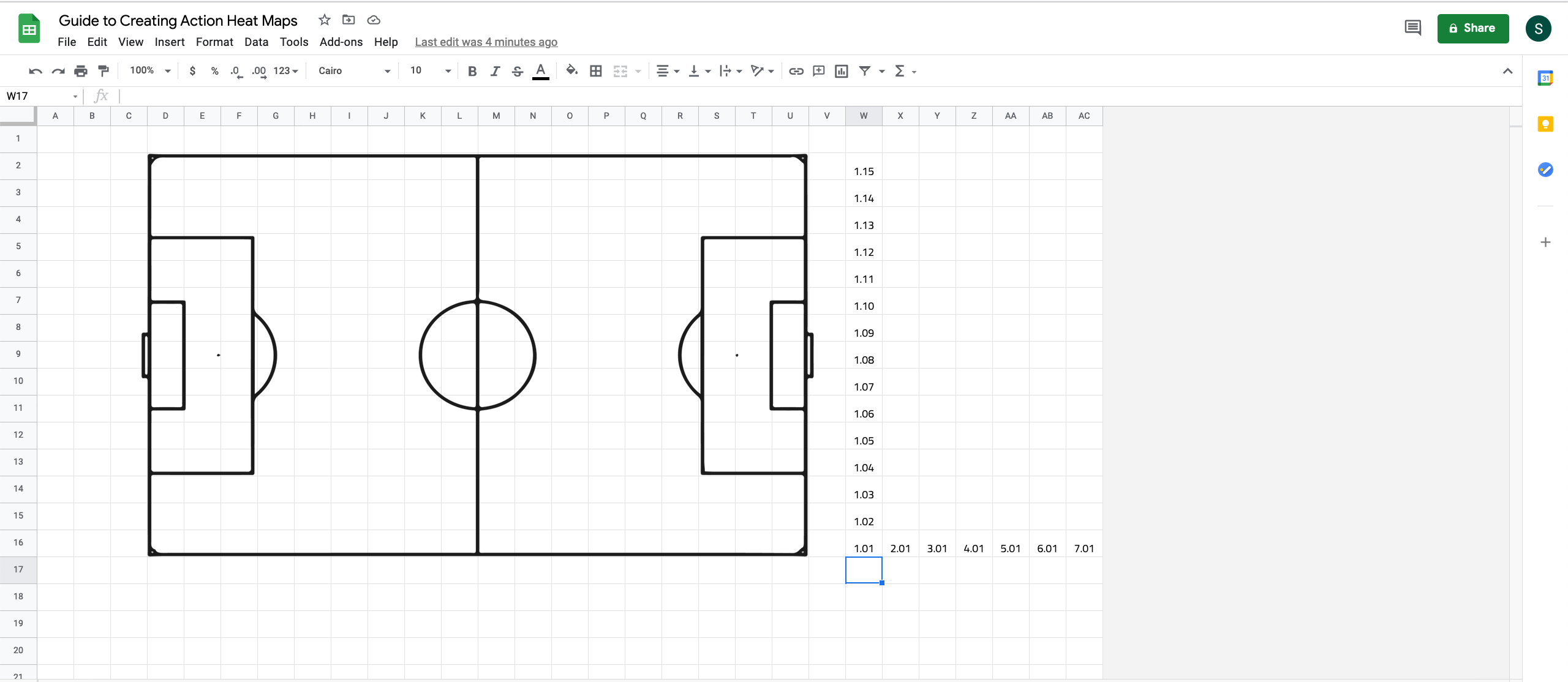
Continue to fill these values until you fill in a grid equal to the size of your pitch. Here that would be filling 18 cells horizontally and 15 vertically, to get an 18 x 15 grid, so it should look like this:
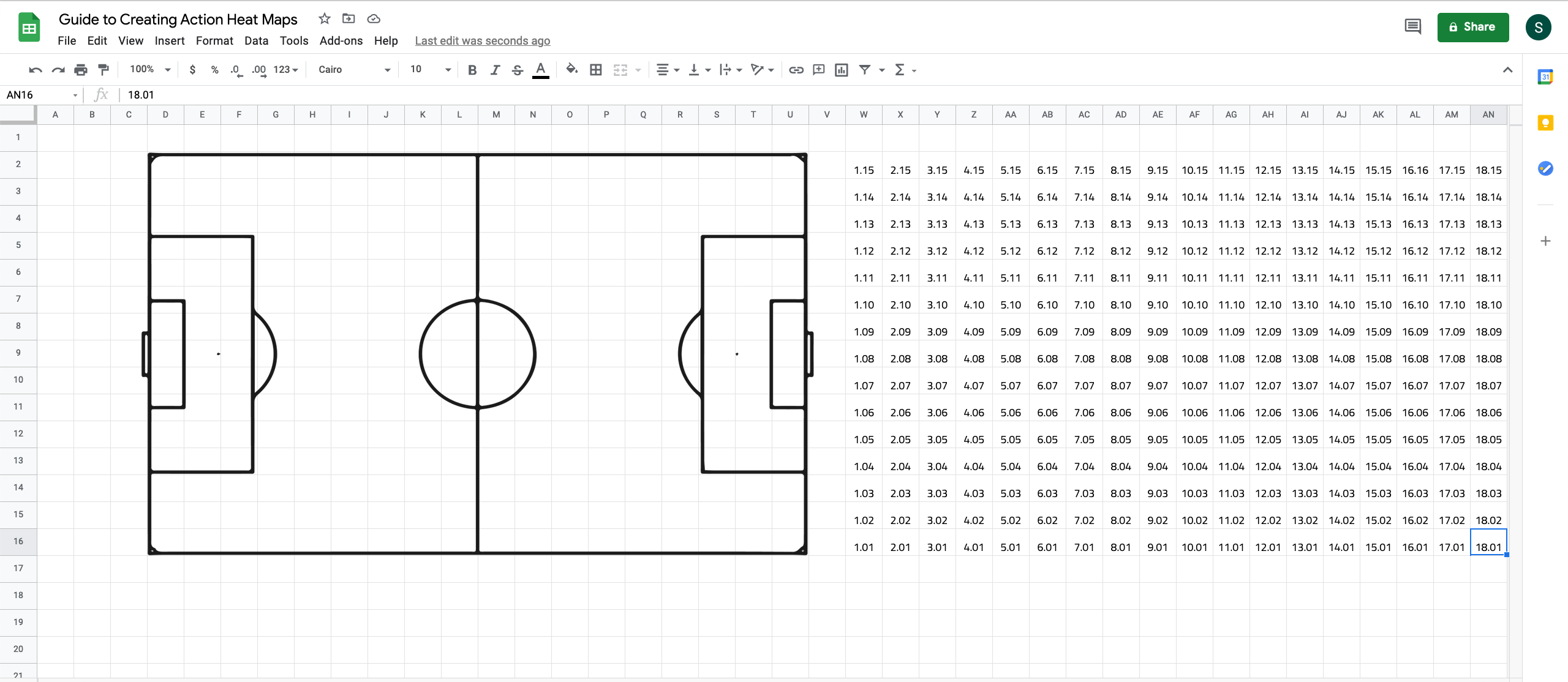
Just to explain why we’re doing this, essentially, we are creating a unique id for every cell contained in the pitch area. These values will then form the reference for the locations of the events we want to map.
Step 2: Mapping your values
In a separate sheet, input your x-y co-ordinate values. In three adjacent columns, create fields called ‘x bin’, ‘y bin’ and ‘bin id’ (so you should have 5 columns in total).
In the ‘x bin’ column, input the following formula:
=INT(A2/(100/18))+1
And in the ‘y bin’ column, input the following:
=INT (B2/(100/15))+1
In the ‘bin id’ column, input the following:
=C2+(D2/100)
(this is assuming your x & y co-ordinates are in the A & B columns. If not, just replace A2 & B2 with the relevant column names, and likewise for C2 & D2 in the bin id formula).
Here’s the explanation for this step (if you are familiar with the concept of binning, this is basically a manual binning process, and you can skip the explanation if you want).
So now, we’re trying to figure out which one of these cells, both vertically and horizontally, our data fits into. Using Excel’s built in INT function makes this easy. It returns only the integer for a given division operation, which in this case is our x value divided by (100/18), the length of one cell.
Let me use an example. If our x value was 10, which horizontal cell would it need to fit into? Let’s look at it step by step.
We created 18 horizontal zones. So the length of each zone is (100/18)=5.5555. That means the first cell covers all x values from 0 to 5.5555, the second one from 5.55555 to 11.1111, and so on. So, to figure out which zone the value 10 would be in, we need to perform 10/5.5555=1.8. But this doesn’t help, as it isn’t giving us an exact zone number.
So, using the INT function, the value of the operation becomes 1, instead of 1.8, and then we add 1 to this value (hence the +1 at the end of that formula), to get 2.
The same logic applies to the y-bin process as well, but with the zone size being (100/15=6.666) instead.
What makes this convenient is that if you choose to resize your pitch (i.e. use a different number of zones), to 12 x 8 zones, for example, you can simply replace the 18 and 15 here with 12 and 8 to readjust the zone allocations.
The final bit of this process is relating these bins to the values we have next to the pitch, which is where we use the ‘bin id’ formula. So, for example, if you have an x-value of 50.9 and a y-value of 31.0, you will get an x zone of 10 and a y zone of 5. This will then translate to a bin id of (10+ (5/100))=10.05.
At the end of this, you should get a database that looks something like this:

Step 3: Linking your values to the pitch

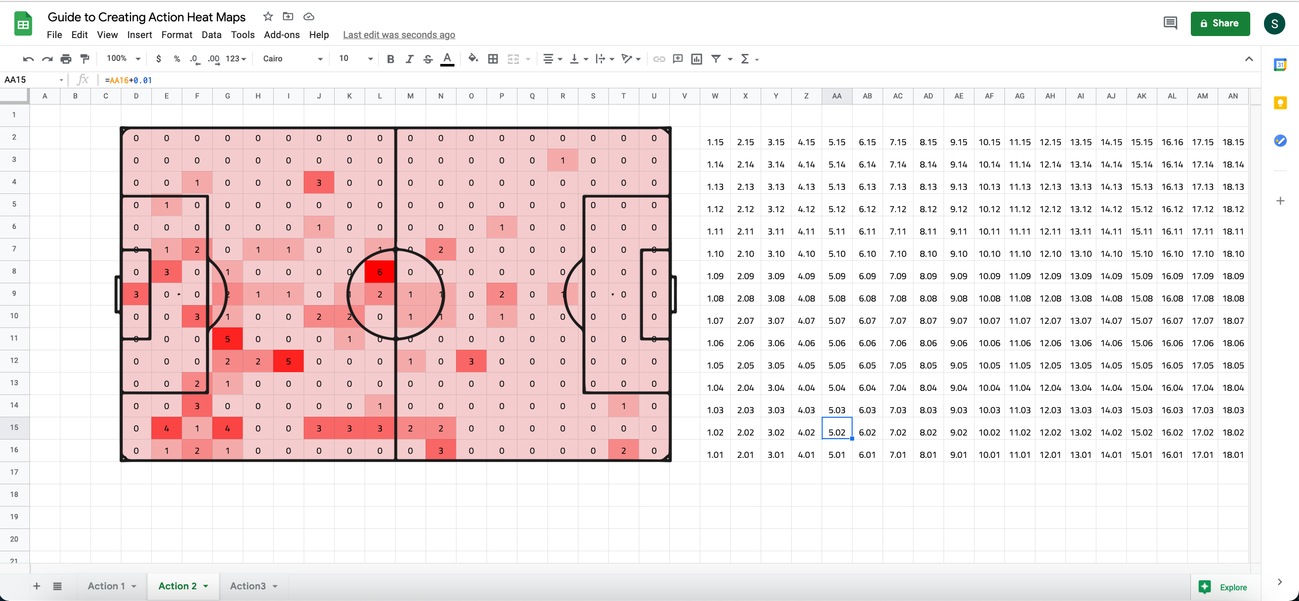
In the bottom left cell of your pitch, use the COUNTIF formula, inputting the range as the range of your bin id values, and the criteria as the bin id of that cell.
(Note: You’ll have to use your arrow keys to navigate to cells covered by the pitch, as Excel will select the picture by default if you click there.)
For example, here is my formula, based on where I made my location database and where I put in the zone values for each cell:
=COUNTIF(Action3!$E$2:$E$560,W16)
Remember to use the ‘$’ symbol, to lock the range, as we’ll be copy-pasting this formula for the entire pitch area.
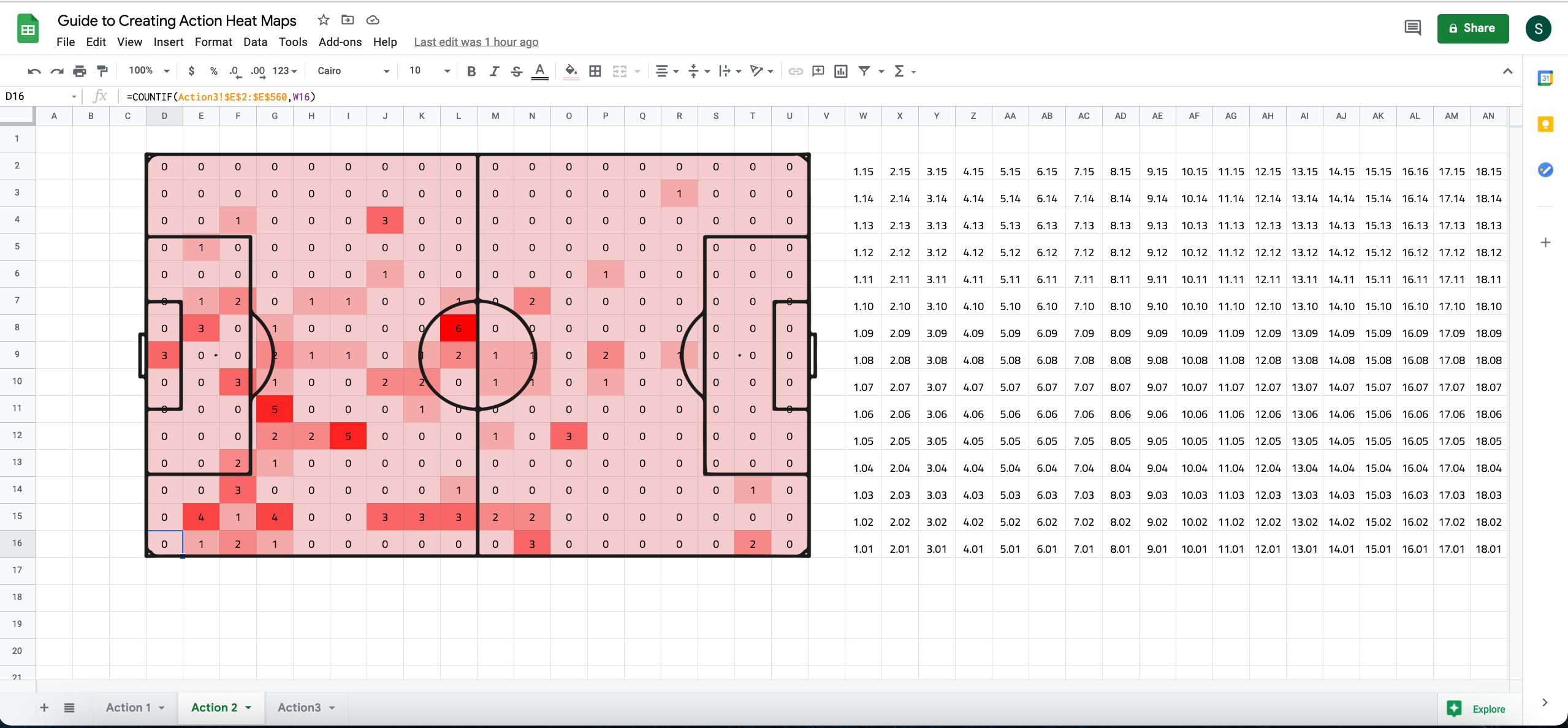
Now copy this formula and paste it throughout the pitch area. With your range locked, and the zone values properly aligned with the pitch, the formula will automatically adapt and give you the desired values, so you should get something like this:
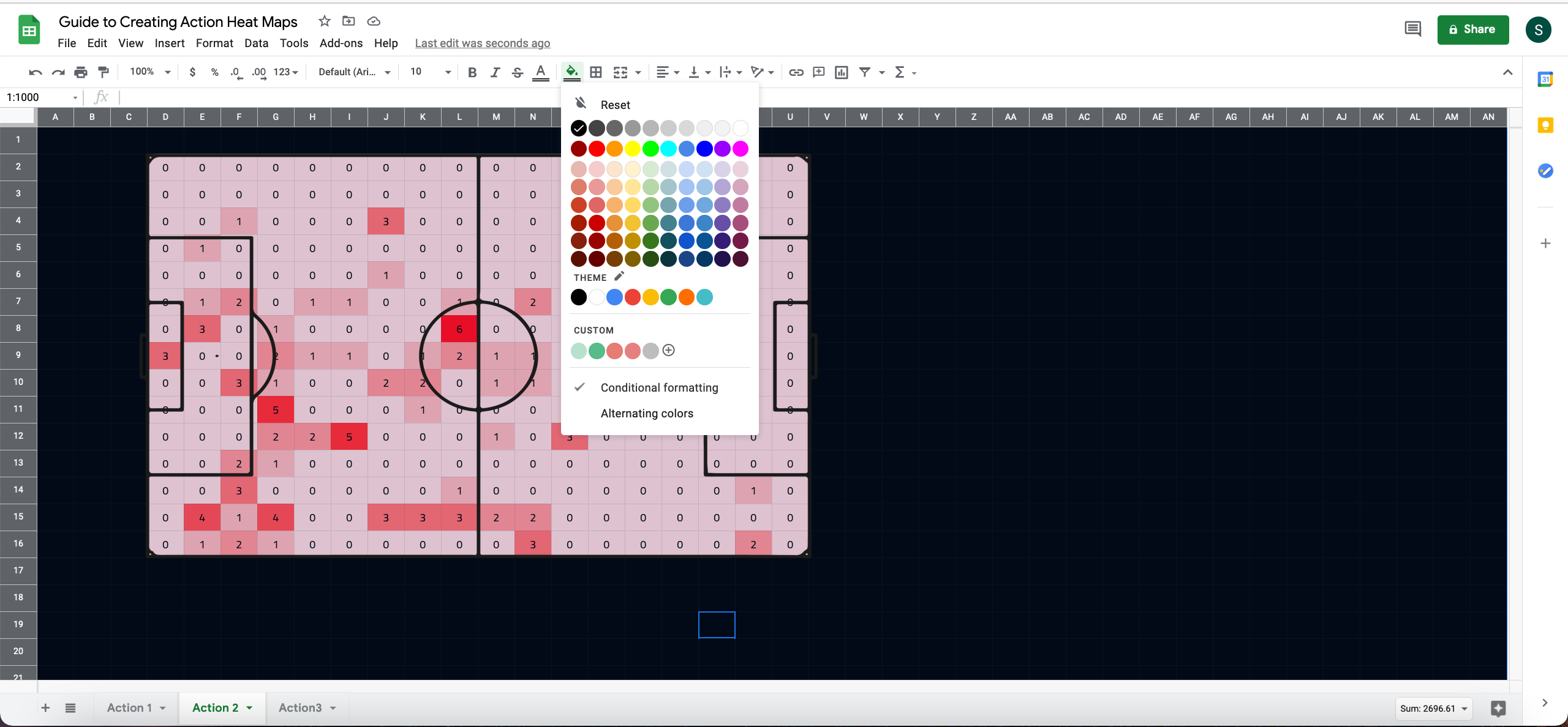
Step 4: Creating the Football heatmap
This is the easiest bit of the process. Simply navigate to one of the cells on the pitch, press ctrl+A, to select all of them, click on conditional formatting and go to ‘New Rule’.
There, you can pick either a ‘2-color scale’ or ‘3-color scale’, and set it to whichever colour(s) you like (I’ll go with white to red here):

Personally, I prefer dark themes, so I will often go with a black to red scheme with a white pitch outline over white to red, so it looks like this:
Now, if you, like me, find those values annoying, simply select all the cells again, press ctrl+1 to open the Format Cells menu. There, go to custom, and instead of General, type in three semi-colons (;;;)
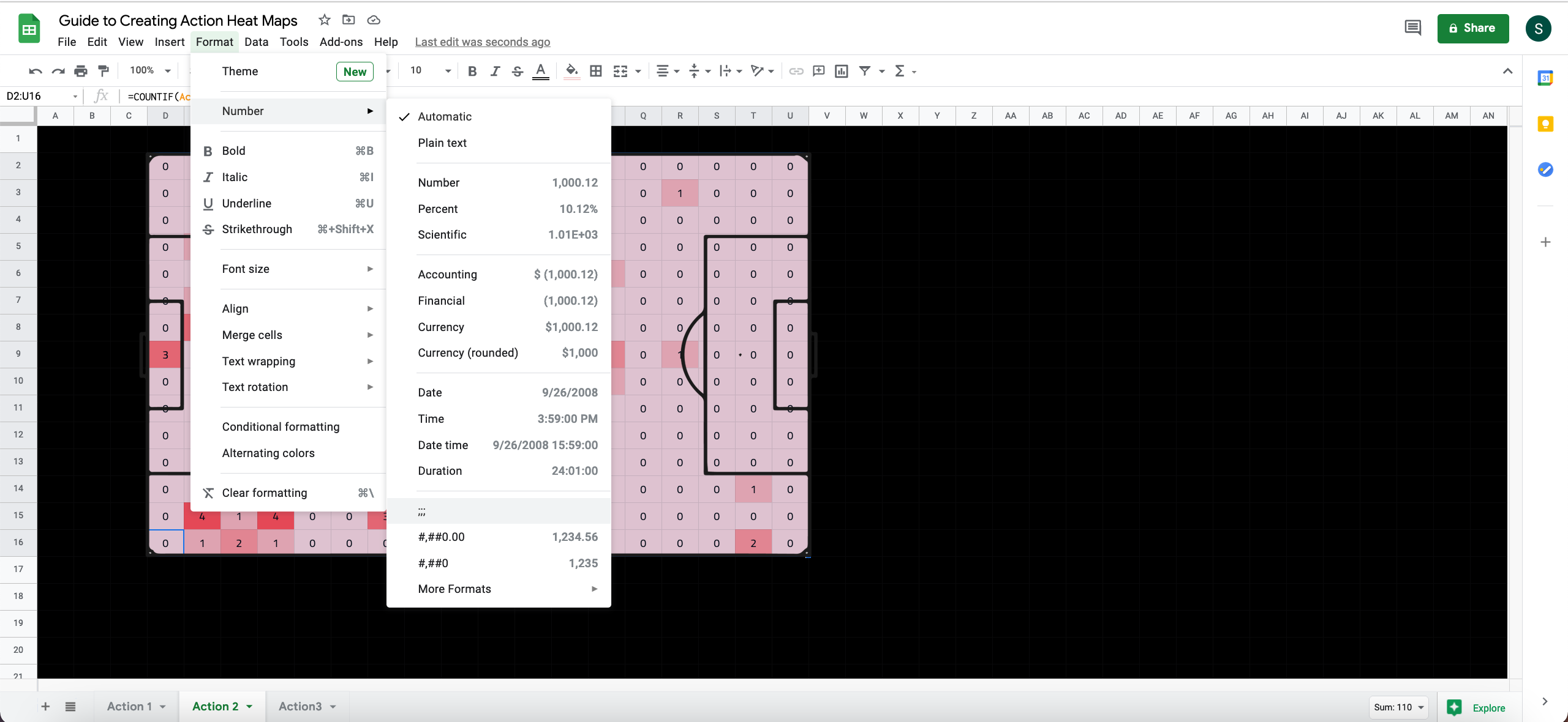
This will hide the text and give you a nice, clean colour map:

Step 5: Saving the Football heatmap as an image

And that’s it! We’re done. Of course, if you wanted to put multiple Football heatmaps together, you can use a Tableau dashboard, Canva, Powerpoint, or whichever app you prefer.
Don’t miss out on this opportunity to expand your football analysis toolkit.
Read “A Guide to Football Pitch Zones” here.
Published by